Hello Friends, In the last blog we are learned how to build react component using higher order components pattern. In this blog post we are going to talk about another interesting pattern for building reusable react component.This pattern allows us to build components that encapsulate complex functionality while providing flexibility to customize the rendering and behavior of their child components. Lets start with building a simple example , you can download the code we worked in below blog post from navinprasadofficial/compound-component-example (github.com).
Sample Application without Compound Component Pattern
Below is a sample code for a model component without compound component pattern
import React, { useState } from "react";

interface ModalProps {
  children: React.ReactNode;
}

const Modal: React.FC<ModalProps> = ({ children }) => {
  const [isOpen, setIsOpen] = useState(false);

  const openModal = () => {
    setIsOpen(true);
  };

  const closeModal = () => {
    setIsOpen(false);
  };

  return (
    <div>
      <button onClick={openModal}>Open Modal</button>
      {isOpen && (
        <div>
          <h2>Hello, Modal!</h2>
          <p>This is a simple modal dialog.</p>
          {children}
          <button onClick={closeModal}>Close Modal</button>
        </div>
      )}
    </div>
  );
};

export default Modal;
Here are step by step explain of above model component
- The code defines a
<Modal>component that takes in achildrenprop of typeReact.ReactNode. - Within the component, the
useStatehook is used to manage the state of the modal. TheisOpenstate variable represents whether the modal is currently open or closed. - The component provides two functions:
openModalandcloseModal, which update theisOpenstate accordingly. - In the JSX markup returned by the component, a button is rendered that triggers the
openModalfunction when clicked. Additionally, when theisOpenstate istrue, a modal dialog is displayed with a heading, paragraph, and thechildrencontent. A button is also provided to close the modal, triggering thecloseModalfunction. - The
<Modal>component is exported as the default export from the module, allowing it to be imported and used in other parts of the application.
Overall, this implementation provides a simple modal component with the ability to open and close the modal dialog based on user interaction. The children prop allows for flexible customization of the modal’s content.
How lets us import this in App and see how it works.
import React from "react";
import "./App.css";
import Modal from "./components/Modal";

function App() {
  return (
    <div className="App">
      <Modal>Model component</Modal>
    </div>
  );
}

export default App;
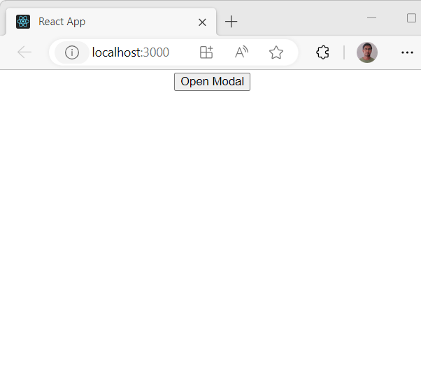
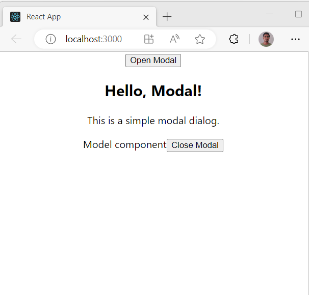
here are the output

click on Open Model button

Now let us see what are the problem in above Model component.
Here are a few disadvantages of the code in comparison to using the Compound Component Pattern:
- Limited customization: The code does not provide an easy way to customize the individual parts of the modal, such as the header, body, or footer. In the Compound Component Pattern, each component is responsible for rendering a specific part, allowing consumers to customize and compose those parts as needed. Without this pattern, customization options become limited.
- Prop drilling: In the given code, the
childrenprop is used to pass the content to the modal. However, if the modal needs to access additional props or context, it becomes challenging. Prop drilling, where props are passed down through multiple levels of components, can become complex and cumbersome. The Compound Component Pattern simplifies this by using context or other techniques to share data between the components. - Component hierarchy: Without the Compound Component Pattern, the modal’s components are not explicitly defined, and their relationship is implicit. This can make it harder for developers to understand the structure of the modal and can lead to tightly coupled code. The Compound Component Pattern promotes a clear and explicit component hierarchy, making the code more organized and maintainable.
- Reusability: The code lacks the reusability benefits that the Compound Component Pattern offers. With the Compound Component Pattern, individual components can be reused in different contexts, providing flexibility and reducing duplication. In the given code, the modal’s behavior and presentation are tightly coupled, limiting reusability.
- Testing: The lack of explicit components and clear boundaries between them can make unit testing more challenging. With the Compound Component Pattern, each component can be tested independently, ensuring that they function correctly in isolation. In the given code, testing the modal’s functionality and different parts becomes more complex.
In summary, the Compound Component Pattern offers advantages such as better customization, reduced prop drilling, clearer component hierarchy, improved reusability, and easier testing. By adopting the Compound Component Pattern, developers can create more flexible and maintainable components, resulting in a more robust and scalable codebase.
Same Application refactored using Compound Component Pattern
So to overcome all above problems let us refactor the above code using compount component pattern.
import React, { useState } from "react";

interface ModalProps {
  children: React.ReactNode;
}

interface ModalContentProps {
  children: React.ReactNode;
}

interface ModalFooterProps {
  children: React.ReactNode;
}

const CompoundModel: React.FC<ModalProps> & {
  Content: React.FC<ModalContentProps>;
  Footer: React.FC<ModalFooterProps>;
} = ({ children }) => {
  const [isOpen, setIsOpen] = useState(false);

  const openModal = () => {
    setIsOpen(true);
  };

  const closeModal = () => {
    setIsOpen(false);
  };

  return (
    <div>
      <button onClick={openModal}>Open Modal</button>
      {isOpen && (
        <div>
          {children}
          <CompoundModel.Footer>
            <button onClick={closeModal}>Close</button>
          </CompoundModel.Footer>
        </div>
      )}
    </div>
  );
};

CompoundModel.Content = ({ children }) => <>{children}</>;
CompoundModel.Footer = ({ children }) => (
  <div>
    {children}
    <button>Close Modal</button>
  </div>
);

export default CompoundModel;
Here’s an explanation of the code
- The code defines the
ModalPropsinterface, which specifies the expected prop types for the<Modal>component. In this case, it only expects achildrenprop of typeReact.ReactNode. - Two additional interfaces,
ModalContentPropsandModalFooterProps, are defined to specify the expected prop types for the<CompoundModel.Content>and<CompoundModel.Footer>components, respectively. Both of them also have achildrenprop of typeReact.ReactNode. - The
<CompoundModel>component is defined as a function component (React.FC) that accepts theModalPropsas its prop type. It also has additional propertiesContentandFooter, which are assigned later. - Inside the
<CompoundModel>component, the state variableisOpenand theopenModalandcloseModalfunctions are declared using theuseStatehook. They are responsible for managing the open and close state of the modal. - The JSX code within the
<CompoundModel>component renders a button with anonClickhandler that triggers theopenModalfunction. WhenisOpenistrue, the modal content is rendered, along with the<CompoundModel.Footer>component. - The
<CompoundModel.Content>and<CompoundModel.Footer>components are defined inside the<CompoundModel>component. They are declared as separate function components that accept the corresponding prop types (ModalContentPropsandModalFooterProps). These components render the providedchildrenprop and additional elements like buttons. - Outside the
<CompoundModel>component definition, the<CompoundModel.Content>and<CompoundModel.Footer>components are assigned to theContentandFooterproperties of the<CompoundModel>component, respectively. This allows them to be accessed as static properties of the<CompoundModel>component. - Finally, the
CompoundModelcomponent is exported as the default export of the module, making it available for import and use in other components.
By using the Compound Component Pattern, this code allows consumers of the <CompoundModel> component to customize the content and footer separately by utilizing the <CompoundModel.Content> and <CompoundModel.Footer> components. It provides more flexibility, reusability, and maintainability compared to a traditional component structure.
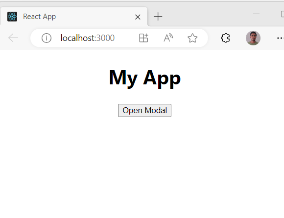
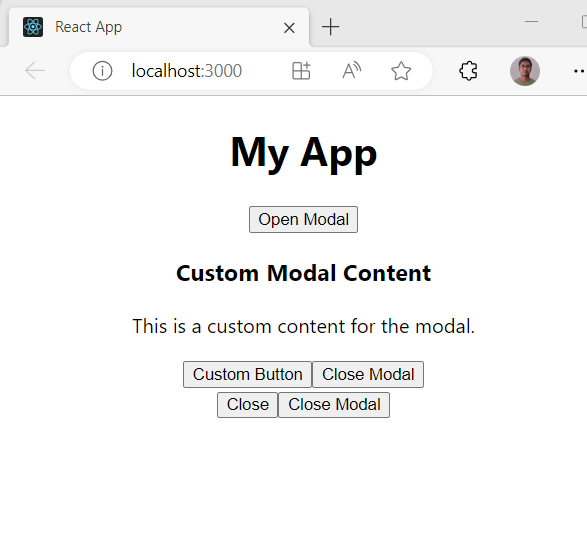
Let us import this and render some custom component too
import React from "react";
import "./App.css";
//import Modal from "./components/Modal";
import CompoundModel from "./components/Model-Compound-Component";

function App() {
  return (
    <div className="App">
      <div>
        <h1>My App</h1>
        <CompoundModel>
          <CompoundModel.Content>
            <h3>Custom Modal Content</h3>
            <p>This is a custom content for the modal.</p>
          </CompoundModel.Content>
          <CompoundModel.Footer>
            <button>Custom Button</button>
          </CompoundModel.Footer>
        </CompoundModel>
      </div>
    </div>
  );
}

export default App;
Here’s an explanation of the code you provided:
- The code imports the necessary modules, including React and the CSS file for styling.
- The
Appcomponent is defined as a function component. - Inside the
Appcomponent’s JSX code, there is a<div>with theclassNameset to “App” to apply a CSS class for styling purposes. - Inside the
<div>, there is another<div>containing the main content of the app. - The heading
<h1>with the text “My App” is rendered inside the inner<div>. - The
<CompoundModel>component is used, which is the refactored version of the modal component using the Compound Component Pattern. It’s imported from the “./components/Model-Compound-Component” file. - Within the
<CompoundModel>component, there are nested<CompoundModel.Content>and<CompoundModel.Footer>components. - The
<CompoundModel.Content>component is used to customize the content section of the modal. Inside it, there is an<h3>element with the text “Custom Modal Content” and a<p>element with the text “This is a custom content for the modal.”. - The
<CompoundModel.Footer>component is used to customize the footer section of the modal. Inside it, there is a<button>element with the text “Custom Button”. - The
<CompoundModel>component, along with its nested content and footer components, is rendered inside the inner<div>of theAppcomponent. - The
Appcomponent is exported as the default export of the module.
This code demonstrates how to use the refactored modal component (<CompoundModel>) with the Compound Component Pattern. By customizing the content and footer using the nested components <CompoundModel.Content> and <CompoundModel.Footer>, you can achieve more flexibility and reusability when working with modals in your React application.


Summary
The Compound Component Pattern is a powerful technique that enhances the flexibility and reusability of React components. By leveraging this pattern, we can create more intuitive and customizable components that provide fine-grained control over their internal structure.
In the blog post, we introduced the Compound Component Pattern and demonstrated its implementation in a modal component. We discussed the advantages of using this pattern, such as improved composability, encapsulation, and separation of concerns.
We started by examining a traditional approach to building a modal component, where all the modal’s parts are tightly coupled within a single component. Then, we refactored the code using the Compound Component Pattern, resulting in a more flexible and extensible design.
By using the Compound Component Pattern, we split the modal into separate components, such as < and CompoundModel.Content><, allowing consumers of the component to customize and compose these parts independently. We emphasized that the parent component, CompoundModel.Footer><, should define the nested components and provide a mechanism to access them.CompoundModel>
We showcased different examples, including a complex form component and a simple example, to demonstrate the versatility of the Compound Component Pattern. We highlighted its ability to enhance code readability, maintainability, and extensibility.
In conclusion, the Compound Component Pattern is a valuable approach for creating reusable and customizable components in React. It empowers developers to build components with clear boundaries, making them easier to understand, maintain, and extend. By adopting this pattern, developers can take full advantage of React’s composition capabilities and create more robust and flexible user interfaces.
